Net Zero Co Lab
Visual ID for NZCL. Written simply with a blinking cursor, symbolising that in sustainability, nothing is ever final. A living identity for DFDS and its customers’ collaboration towards a greener future.
WhoDFDS x Another TomorrowVisual Id.
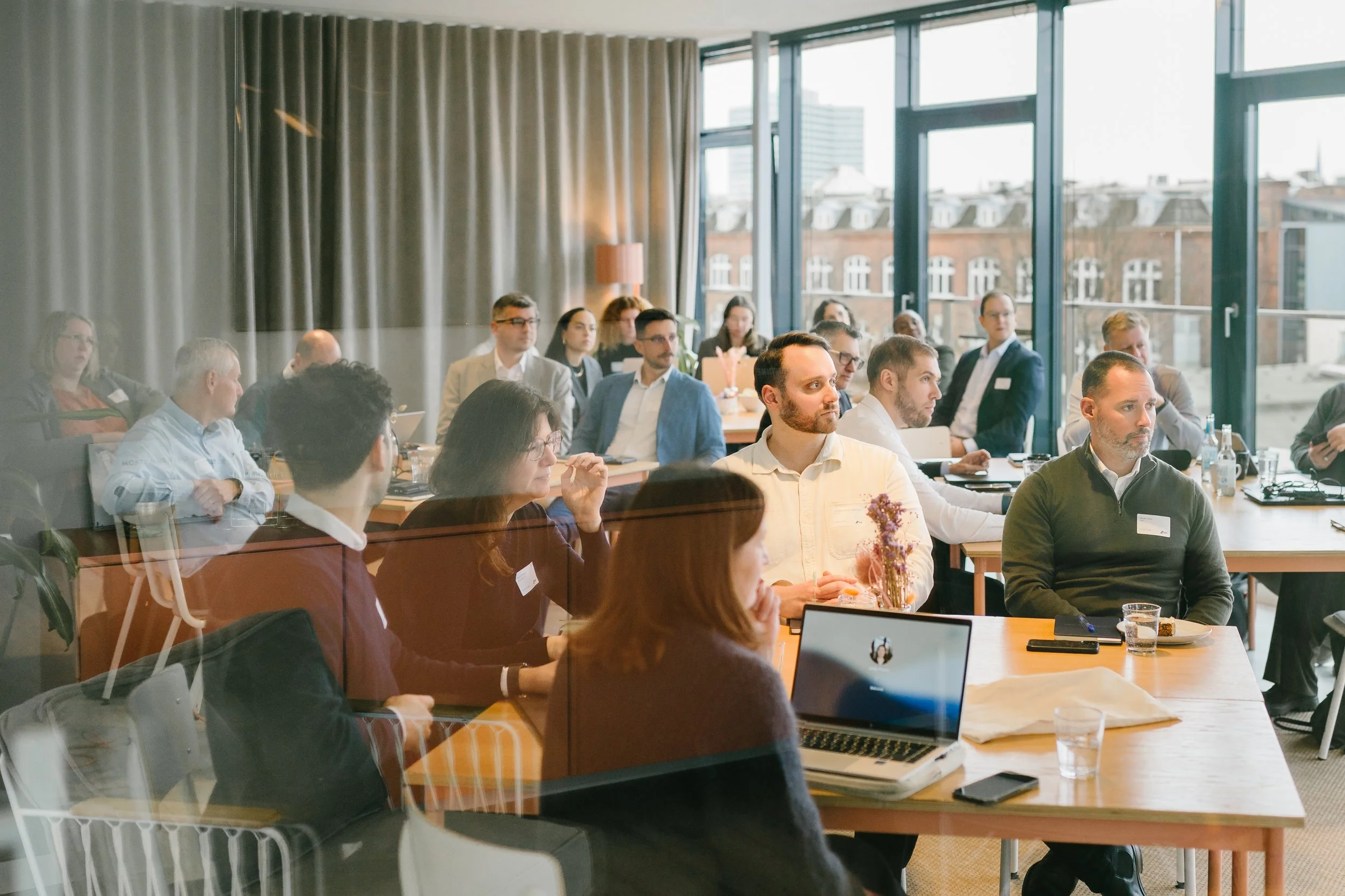
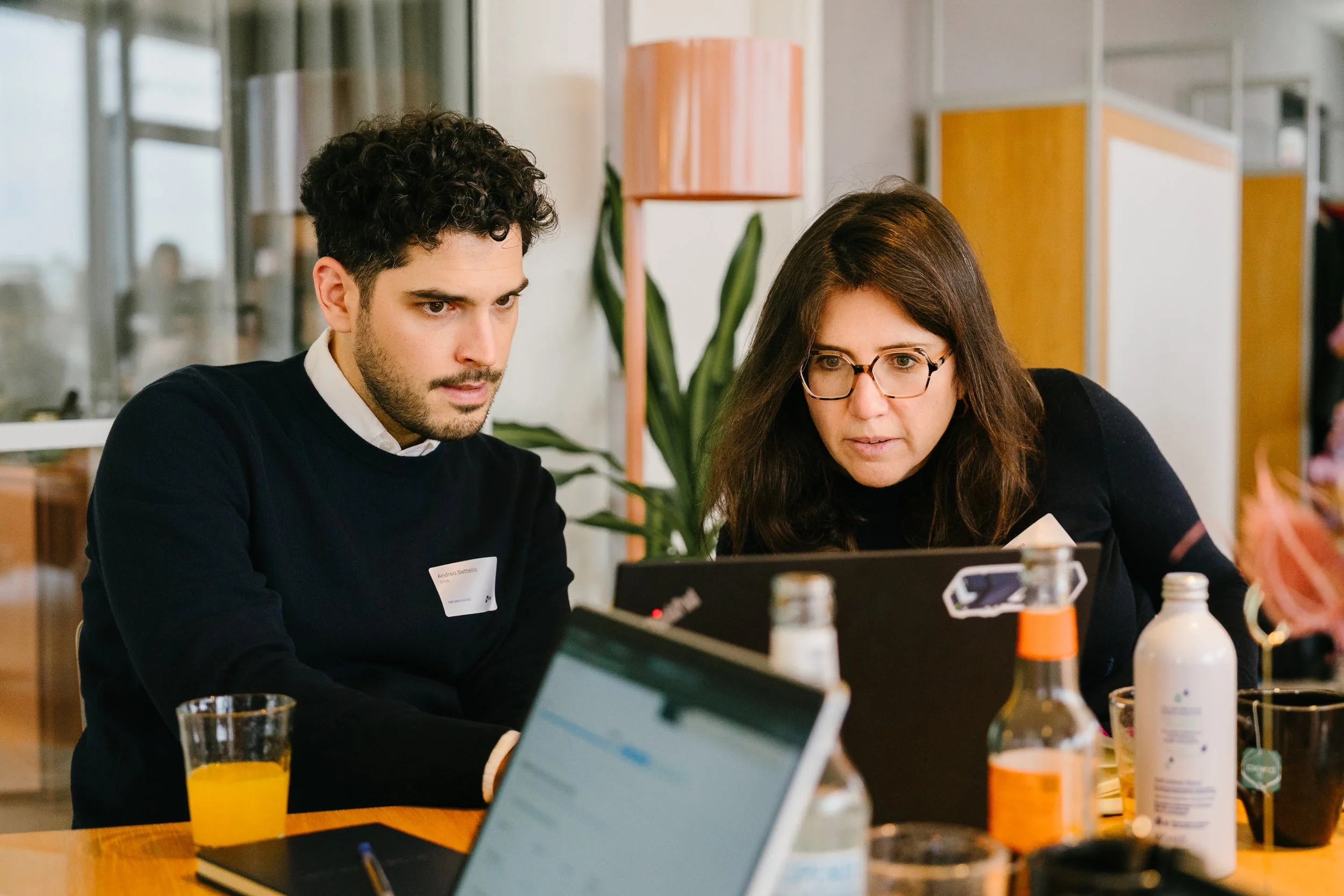
Photography.
Animation.My RoleDeliveriesVisual ID.