eMobility
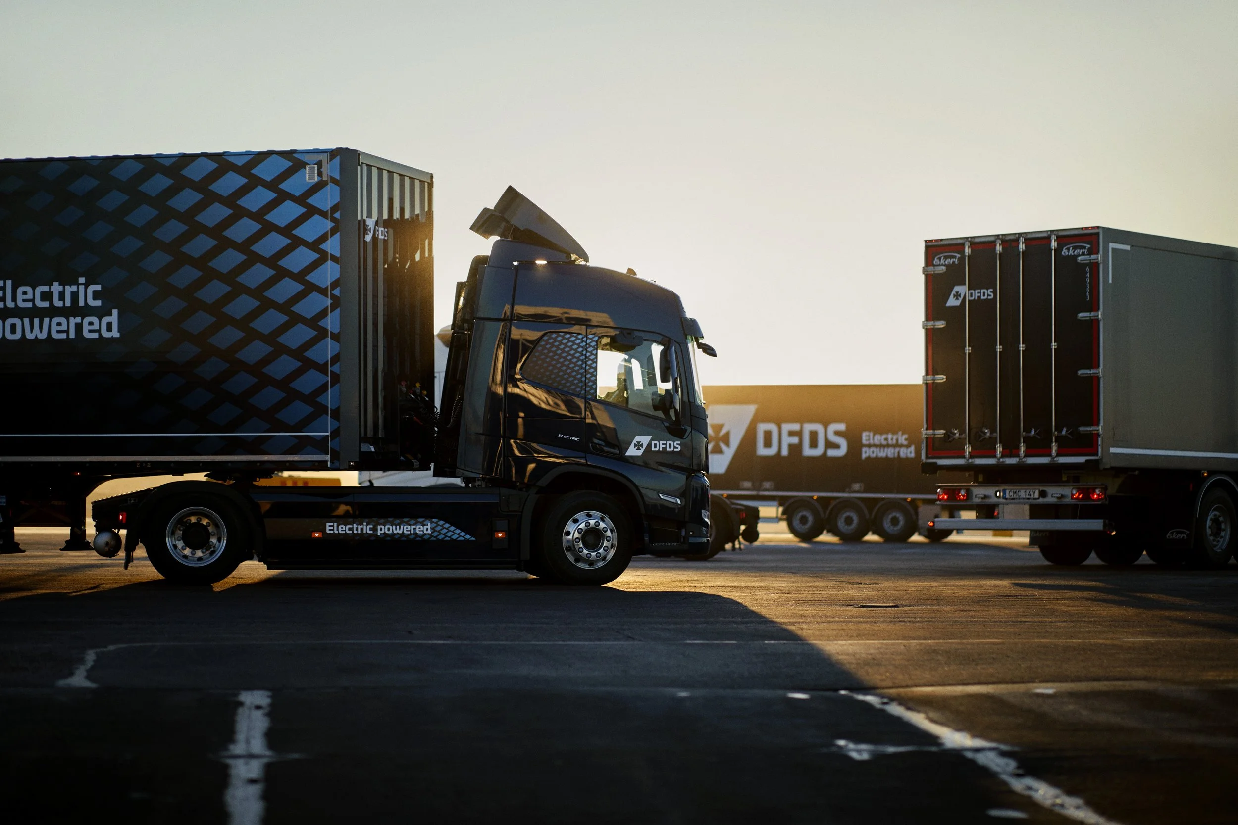
The eMobility identity and campaign for DFDS was made to feel clean, energetic, and forward-looking. It began with a simple idea: to give DFDS electric transport its own clear and distinct visual expression.
DFDS x VolvoMy Role.Creative Direction.
Concept.
Photography.
Truck Design.Who.Visual Id.
Truck Design.
Campaign Film.
Campaign Photography.
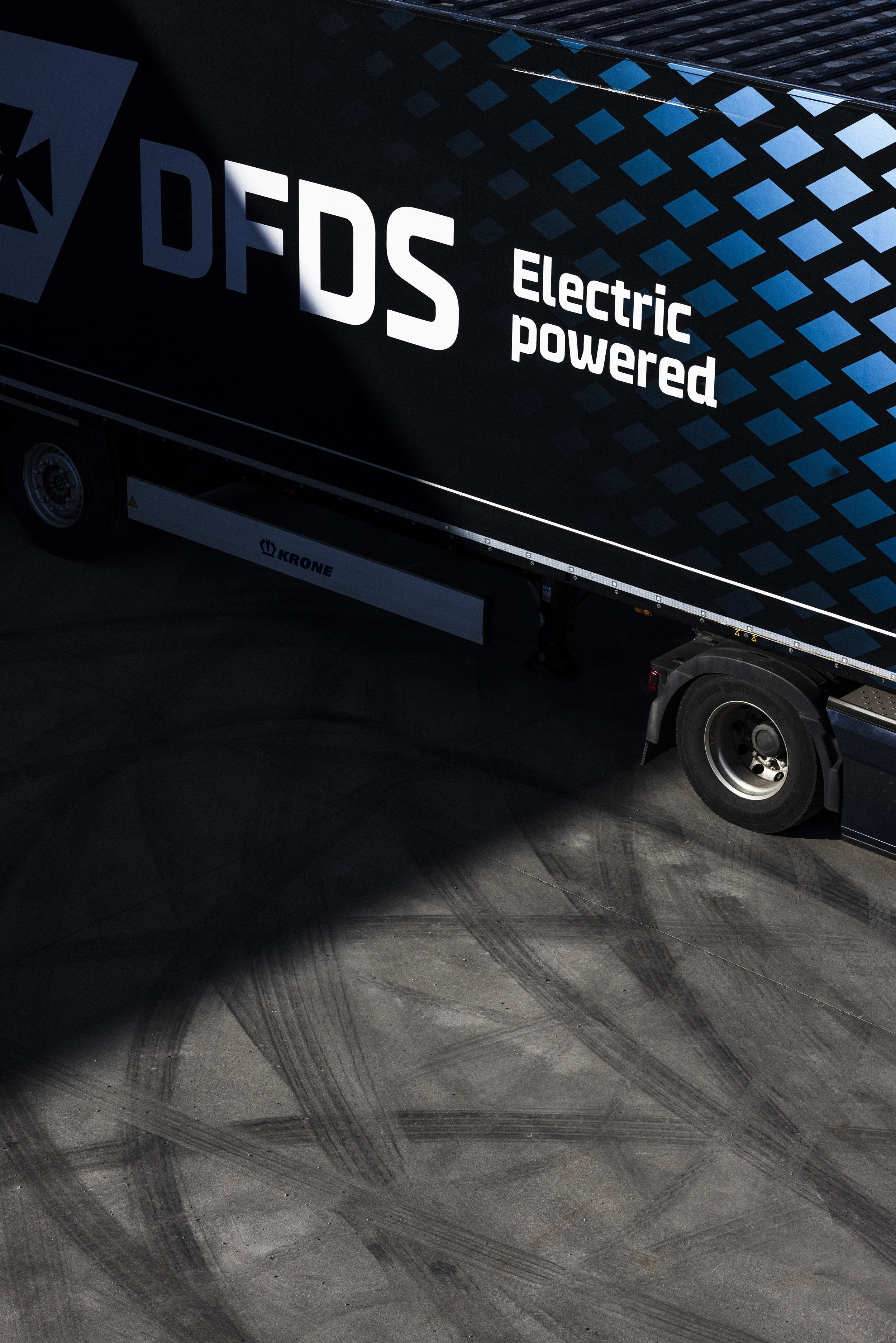
Collab Framework.Deliveries.Each element: colour, graphics to motion, was designed to reflect movement and electricity in a subtle, modern way. The system was flexible, making it easy to apply across both digital and physical touchpoints.

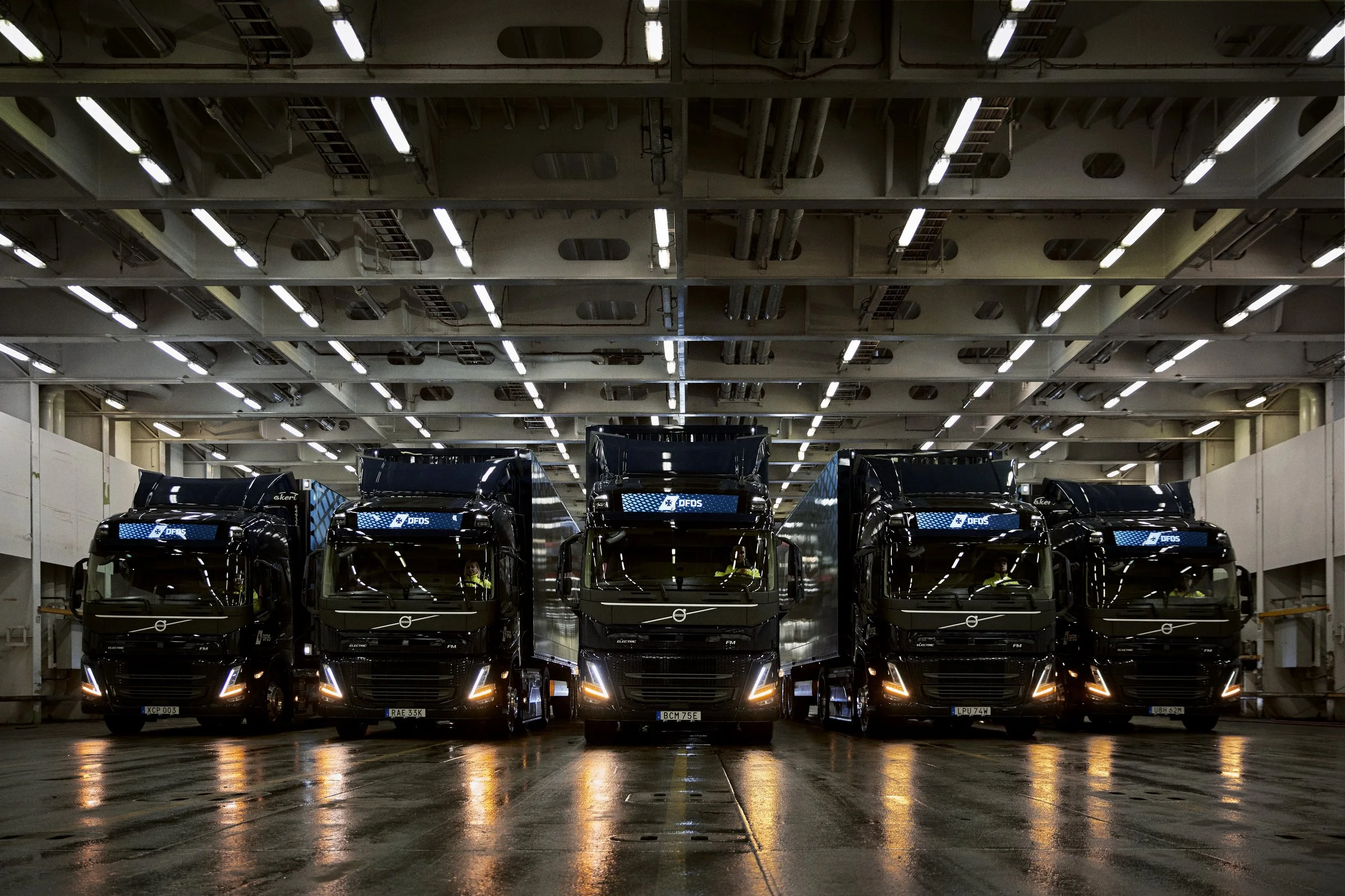
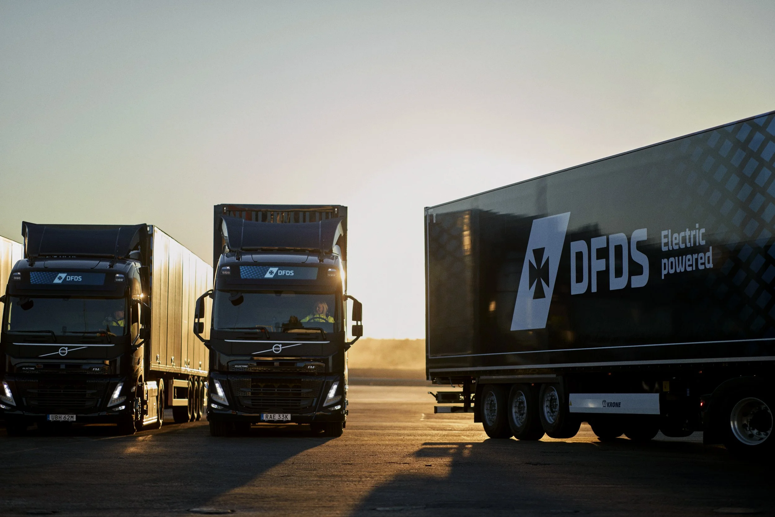
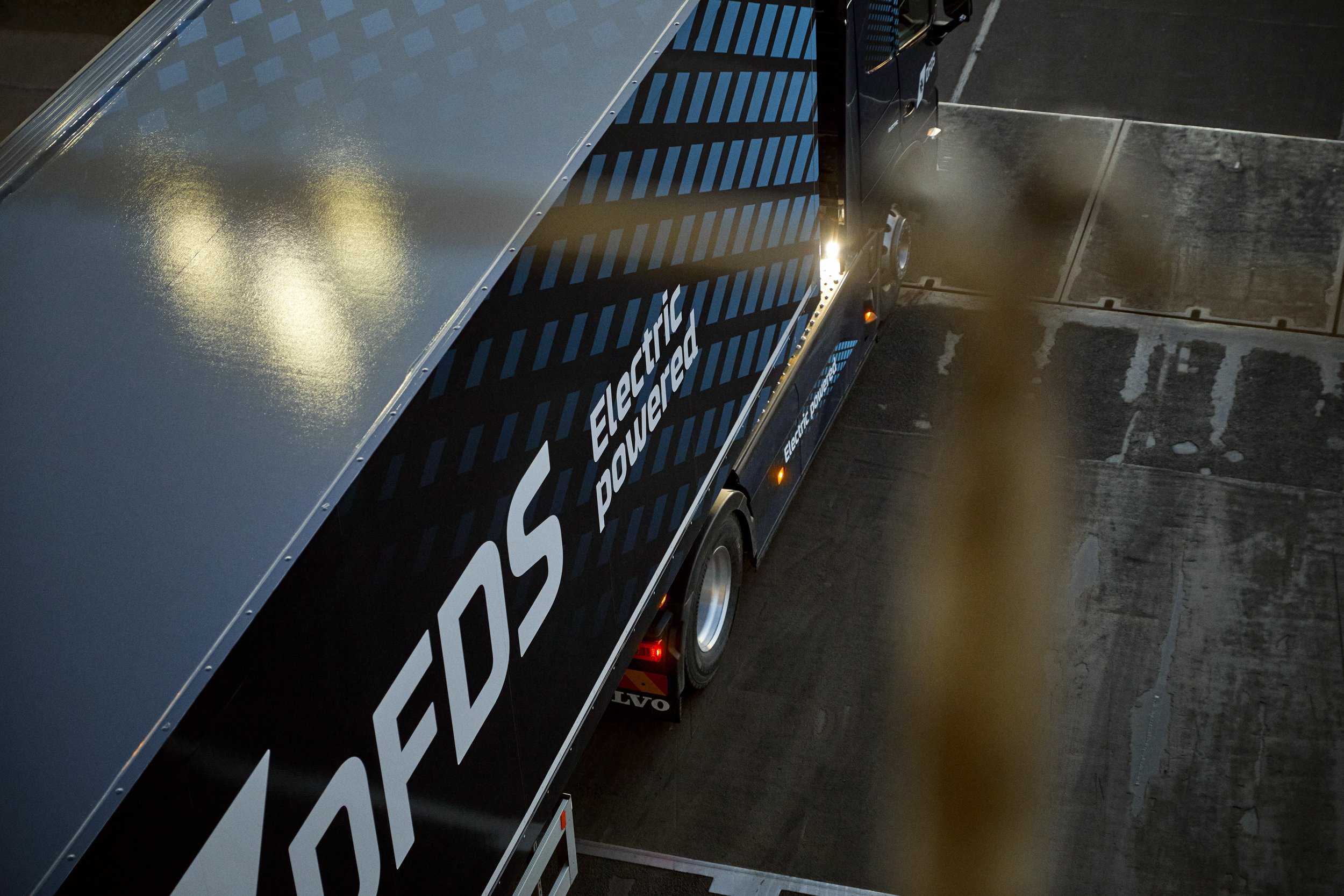
The identity came to life on the electric trucks themselves. Their surfaces became moving canvases, carrying the visual language into the real world and making eMobility instantly recognisable.


The identity even shaped collaborations, including a partnership with Monster Energy, where the visual language adapted without losing its core character.